My work
About me
Let's chat
My work
About me
Let's chat
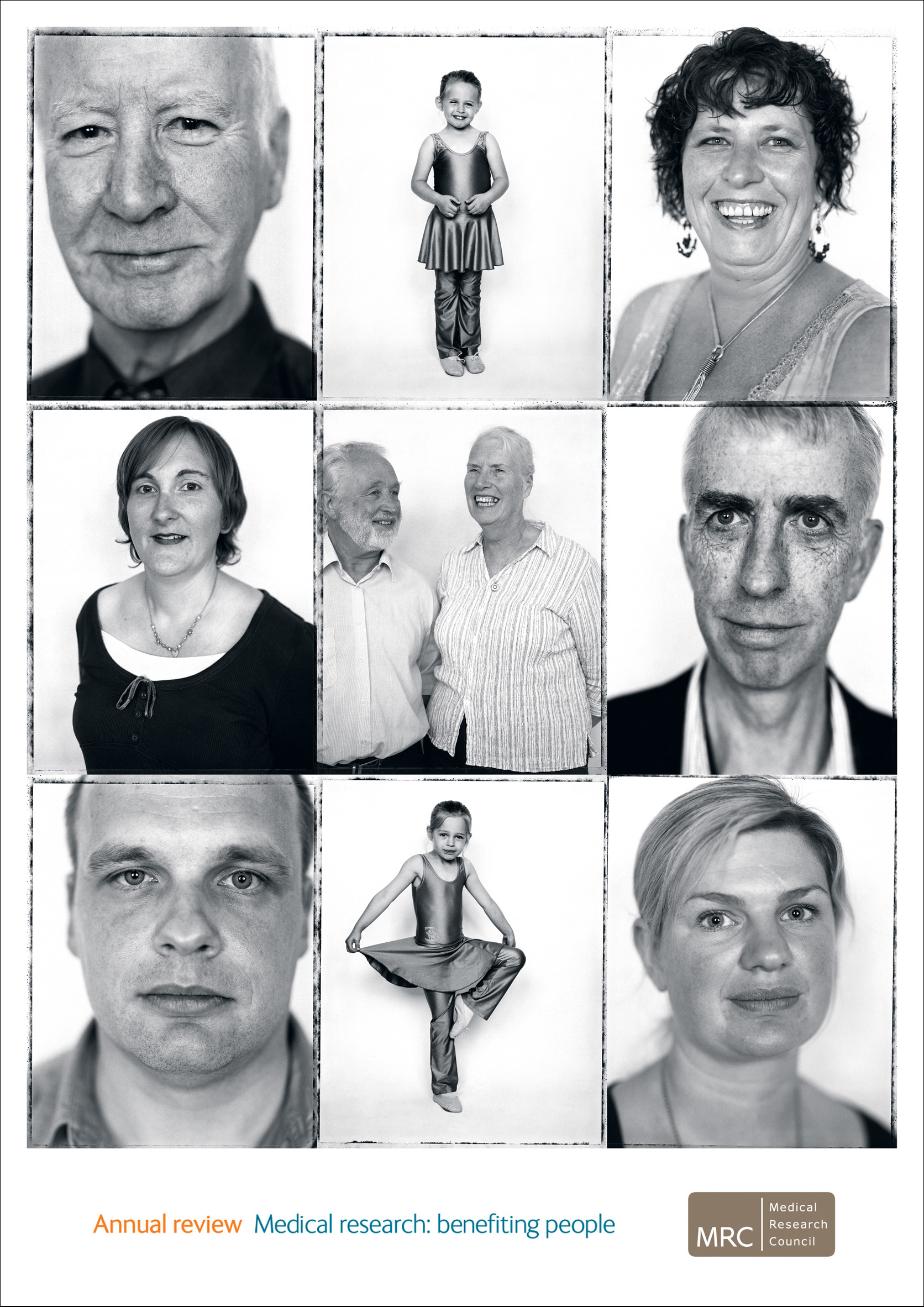
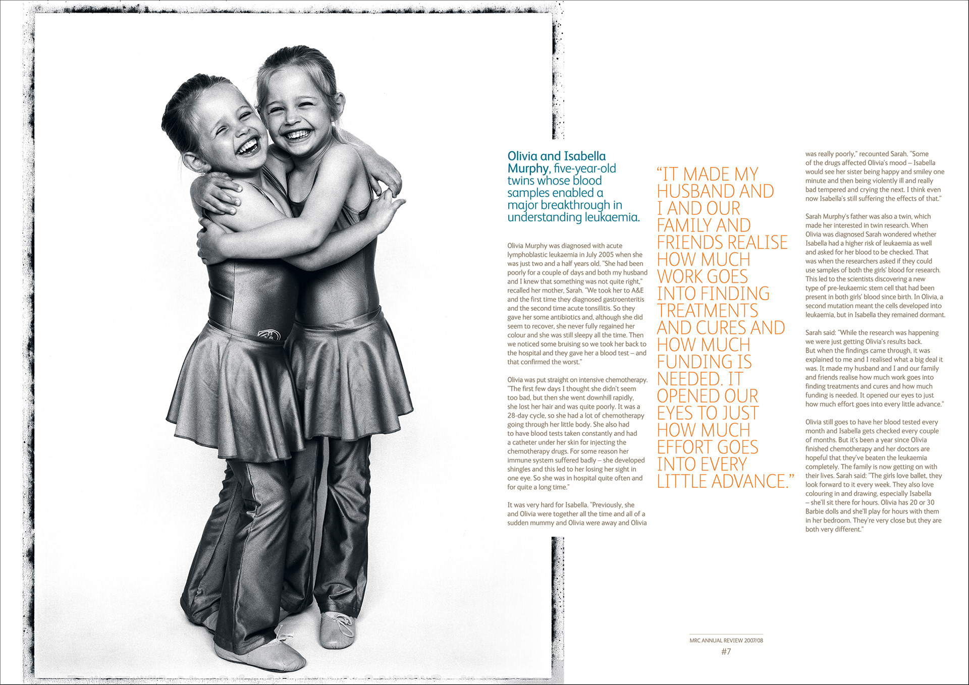
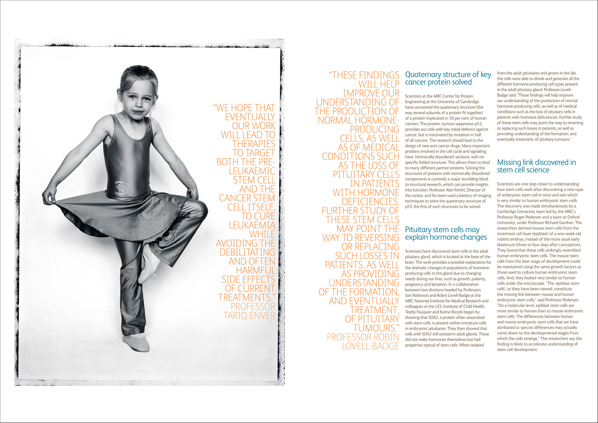
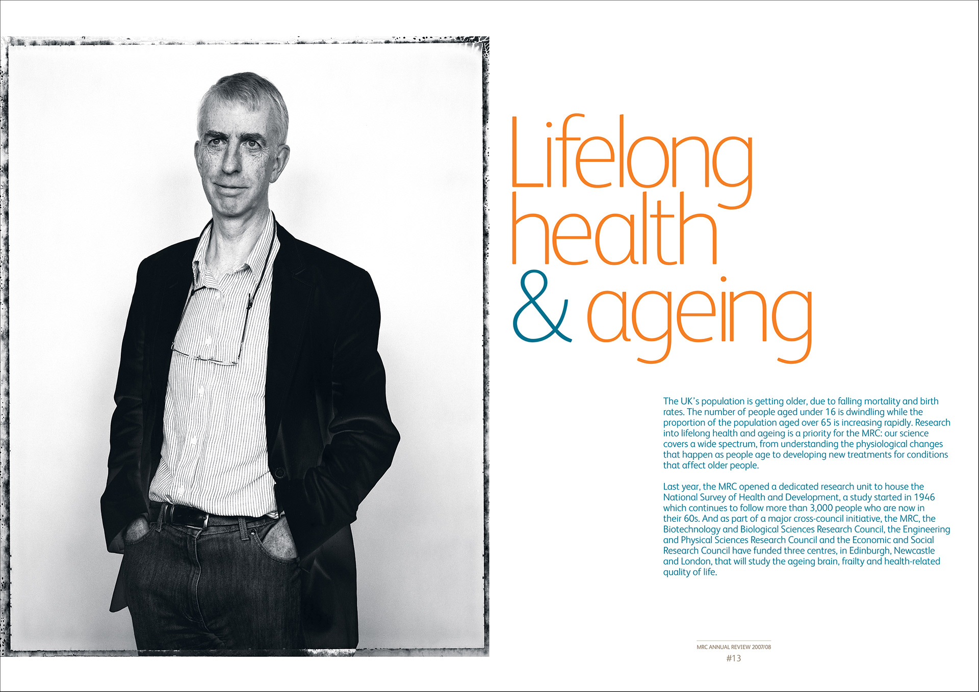
Medical research: benefiting people - Annual review
The Medical Research Council's annual review.
Photos © Noel Murphy
↑
Back to Top