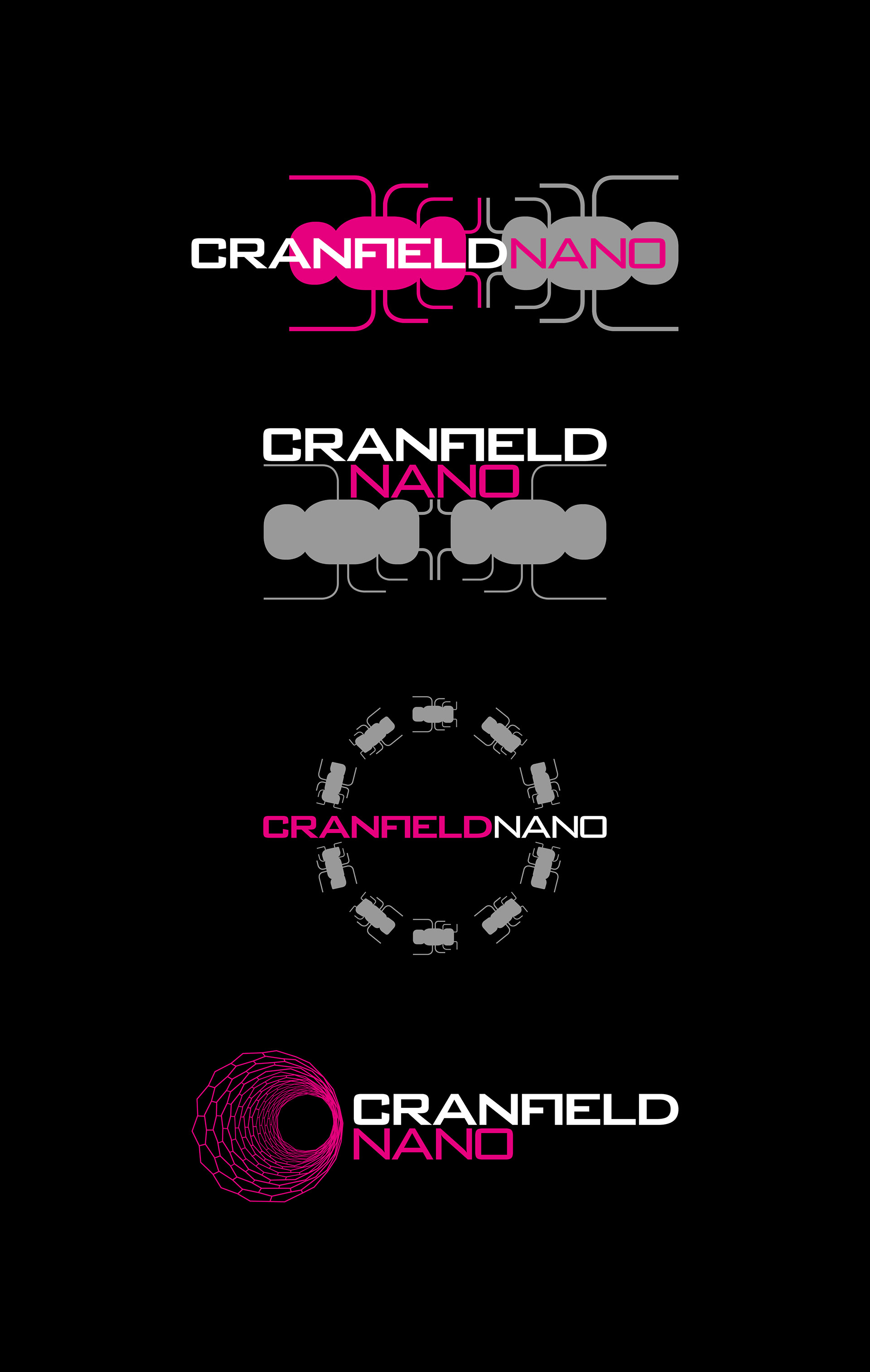
A variation of logo concepts for a university science research department. The logo needed to include the idea of cutting-edge science, nano-technology, innovation and collaboration.
Including an ant-style graphic alongside the modern square typeface, and used a bright magenta colour to really stand out. The ants were a reference to the scientists who work for Cranfield Nano - Applied Nano-Technologists (ANTs), and also as collaboration workers, and small (nano).
The concepts also include a nanotube graphic, and a cell-style structure as secondary options.